


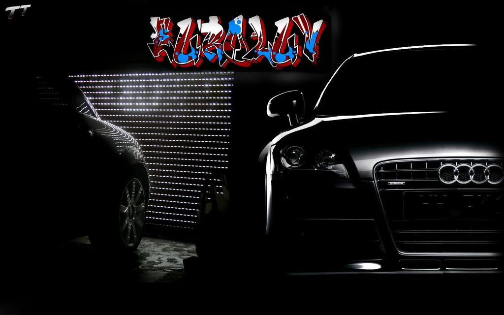
something i threw together....



2nd Gear
Joined: Oct 2006
Posts: 1,054
From:
 RE: something i threw together....
I would get rid of the color name ...keep with the black and white theme, also audi's aren't hondas...use a classier font and you'll have a PERFECT image.
VERY nice photography, you take those?
VERY nice photography, you take those?
2nd Gear
Joined: Oct 2006
Posts: 1,054
From:


1st Gear
Joined: Jan 2007
Posts: 58
From:
RE: something i threw together....
Personally- I like it... but take off the "TT" part
Just do Audi/ Drive it like you stole it.
My opinion..... other than that I like it.
The original I like the other shot in there also however. I'm at work right now other wise I'd mess around with it too.
But I totally agree with the "TAG" style writing on the original. It just looks tacky (no offence!)

4th Gear
Joined: Jul 2006
Posts: 3,716
From: New York
RE: something i threw together....
I'd remove the tag and write my name in the lights.
I'd probably use an old hollywood theme styled font as a guide.
Also removing whatever that weird looking thing is blocking the lights... Just my 2 cents.
I'd probably use an old hollywood theme styled font as a guide.
Also removing whatever that weird looking thing is blocking the lights... Just my 2 cents.

Thread
Thread Starter
Forum
Replies
Last Post